The Making of Apple’s Emoji: How designing these tiny icons changed my life
When design leads to friendship, and that friendship leads back to design, magic happens.
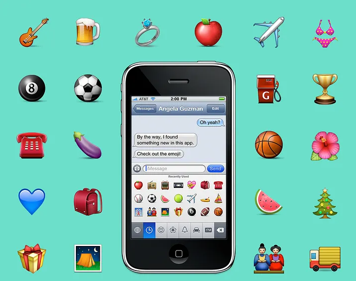
This is the story of how an intern and her mentor designed Apple’s original emoji set and together changed the way people communicate around the world. It was also a project that led them to become lifelong friends, a key ingredient in the success of these tiny icons. In a nutshell, I was the intern and Raymond is my lifelong friend and mentor. In the course of three months, together we created some of the most widely used emoji: face with tears of joy, pile of poo, red heart, and party popper, plus around 460 additional ones. Later, as a full time Apple employee, I even got to create a few more.
It was the summer of 2008, and I was one year away from receiving my MFA in Graphic Design from the Rhode Island School of Design (RISD). It was the same summer I landed an internship at Apple on a team I was eager to meet. The same design team responsible for the iPhone; a magical device that launched the year prior at Macworld Expo in San Francisco. One could only imagine the size of my butterflies as I flew to Cupertino and arrived at 1 Infinite Loop. To add to the uncontrollable fluttering, I had no idea what project I would be given, the size of the team, where I would sit, or if I could really bike to work (I’m terrible on bikes).
Soon after my arrival and meeting the team (oh and biking to work!) I was handed my project. I was still trying to make sense of the assignment I’d just received when someone asked if I knew what an emoji was. And well, I didn’t, and at the time, neither did the majority of the English speaking world. I answered ‘no’. This would all change, of course, as the iPhone would soon popularize them globally by offering an emoji keyboard. Moments later I learned what this Japanese word meant and that I was to draw hundreds of them. Just as I was looking down the hallway and internally processing, “This isn’t type or an exercise in layout, these are luscious illustrations,” I was assigned my mentor.
For the next three months Raymond and I would share an office and illustrated an array of faces, places, flags, animals, food, clothing, symbols, holidays, sports, and well, you probably know the rest. But long before any of this was complete, I had to learn how to design Apple-styled icons. We split the batch and the lesson in humility and craftsmanship began.Raymond taught me everything there was to know about icon design. Little did I know that he, my humble mentor, was one of the best icon designers in the world. In other words, I sat next to one of the best iconographers, got to pick his brain until I could kick off my training wheels, all the while exchanging stories of our time growing up in South Florida including our trips to ‘Pollo Tropical’ in the search of amazing plantains. Lesson in humility, check. My first emoji was the engagement ring, and I chose it because it had challenging textures like metal and a faceted gem, tricky to render for a beginner. The metal ring alone took me an entire day. Pretty soon, however, I could do two a day, then three, and so forth. Regardless of how fast I could crank one out, I constantly checked the details: the direction of the woodgrain, how freckles appeared on apples and eggplants, how leaf veins ran on a hibiscus, how leather was stitched on a football, the details were neverending. I tried really hard to capture all this in every pixel, zooming in and zooming out, because every detail mattered. And for three months I stared at hundreds of emoji on my screen. Somewhere in there we also had our first Steve Jobs review, which had created a shared experience of suspense and success when they were approved for launch. And if Steve said it was good to go, I’d say lesson in craftsmanship, check. Sometimes our emoji turned out more comical than intended and some have a backstory. For example, Raymond reused his happy poop swirl as the top of the ice cream cone. Now that you know, bet you’ll never forget. No one else who discovered this little detail did either. Another example is the order in which we drew them. We left the tough ones to last, so the dancer with the red dress emerged towards the end of my internship as it was the one that kept getting punted. You can thank her ruffled dress for that and Raymond for the final output. The woman’s turquoise dress with the brown waist band, on the other hand, was one I drew earlier in the process. It was inspired by the color palette and proportions of a dress that my sister had created in real life that same year. So from funny backstories to realizing he and I attended high schools less than 30 miles apart, our shared past and days drawing together triggered unstoppable laughing spells with watery eyes and all, in other words, with tears of joy. Ten years after my internship, Raymond and I still fill a room with laughter and he continues to provide me with the most flat out honest feedback to keep me in check, and vice versa. All this is what I believe made the emoji successful, our friendship through design.